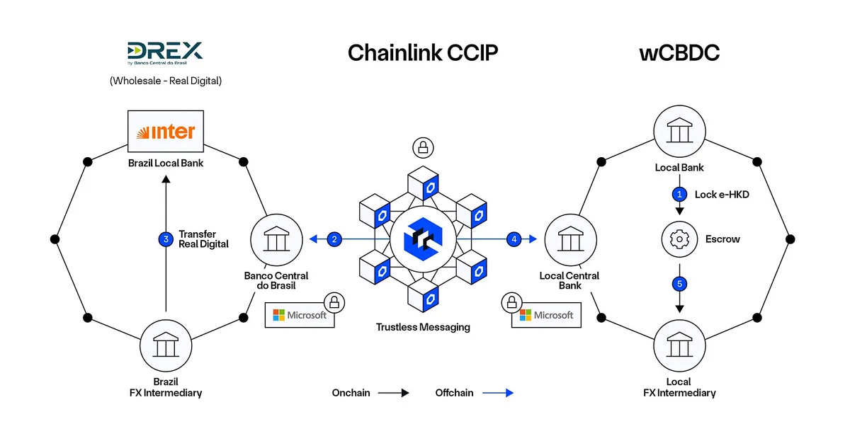
A workflow diagram people actually read is one that answers one question at a time: who does what, in what order, and where the handoffs happen. Most diagrams fail not because the process is complicated but because the drawing tries to show everything at once. The fix is structural, not cosmetic — fewer shapes, clearer lanes, and a hard rule that every box earns its place.
The word itself is a useful reminder. Anatomy comes from the Greek for dissection, and as Wikipedia's overview of anatomy explains, the discipline is the study of the structure of organisms and the relationships between their parts — how things are arranged, and how each piece connects to the next. That is exactly what a good workflow diagram does for a process. You cut the work open, lay the parts in order, and label what connects to what.
This guide walks through the shapes worth using, the swimlane trick that settles ownership arguments before they start, and the pruning habit that separates a diagram people consult from one they screenshot and forget. It sits alongside our broader workflow coverage, where most pieces start from the same principle: make the structure visible before you automate it.
Which symbols do you actually need?
Formal flowchart notation offers dozens of shapes. In practice, four cover nearly everything. A rectangle is a task — something someone or something does. A diamond is a decision, a question with two or more answers. A rounded rectangle or oval marks the start and end. An arrow shows direction, and nothing else.
Resist the temptation to import exotic notation — cylinders for databases, document shapes, off-page connectors — unless your audience already reads that language fluently. Every extra shape type is a small tax on the reader. If a box would confuse a new hire on their first day, swap it for a rectangle with a clearer label.
The label matters more than the shape. "Draft brief" beats "Input stage" every time. Write labels as verbs with objects: review invoice, escalate complaint, archive file. A noun-only label forces the reader to guess what happens there, and guessing is where diagrams lose people.
What are swimlanes, and why do they settle arguments?
A swimlane is a horizontal or vertical band that groups every step by who owns it — a person, a team, or a system. One lane per actor, no exceptions. When a step sits in the wrong lane, the diagram has just surfaced a real disagreement about responsibility, which is far cheaper to resolve on paper than in a missed handoff.
Swimlanes earn their keep the moment a process crosses more than one desk. An invoice approval that moves from sales to finance to management reads instantly when each lane is labelled, and the arrows between lanes show exactly where work changes hands. Those crossing points are where processes break in real life, so a diagram that makes them visible has already paid for itself.
Keep lane count low. Two or three lanes stay legible; six start to look like a transit map. If you need more actors, consider whether you are really diagramming one process or several, and split the drawing.
How do you prune a diagram down to something readable?
The most common failure is completeness. Someone maps every exception, every retry, every edge case, and produces a wall of diamonds nobody can follow. Our analysis across process documentation suggests a simple test: if a step only matters once a quarter, it probably belongs in a footnote, not the main flow.
Prune in three passes. First, cut any step that happens automatically without a decision — collapse it into the arrow or fold it into the neighbouring box's label. Second, merge steps that always happen together. Third, move rare exceptions to a short list under the diagram rather than extra branches inside it.
A practical ceiling: if the diagram needs more than roughly a dozen boxes, readers stop tracing the flow and start skimming it. That is the moment to split the drawing into a top-level overview and one detail diagram per branch. Two small diagrams beat one large one almost every time.
What does this mean for AI-assisted workflows?
The same anatomy applies when a step is done by a model rather than a person. Give the AI its own swimlane, labelled with the tool and what it produces. A diagram that shows a person reviewing an AI draft before it moves downstream is doing honest work; one that shows a magical arrow from "prompt" to "published" is hiding the failure mode.
That review step is not decoration. Our piece on a verification workflow for AI outputs makes the same structural point: the check belongs in the flow, drawn as a real task with a real owner. The same goes for handoffs from a transcript to action items — the pipeline in our transcript-to-action-items guide survives auditing precisely because each step, human or machine, is named and separated. We covered a connected angle in From meeting transcript to action items: a pipeline that survives auditing.
Diagrams also help you spot where a tool is doing quiet work you have not agreed to. Drawing the flow forces you to ask what data crosses each lane boundary — a question that matters whenever a vendor sits in one of your lanes.
Practical steps: drawing one this week
Start with the messiest recurring handoff you own — the thing that stalls in someone's inbox. Then work through this sequence:
- Write the start and end states first. Everything between them is in scope; everything else is out.
- List the steps as verb phrases on sticky notes or plain lines before opening any diagramming tool.
- Sort the steps into lanes by owner. Disagreements here are findings, not obstacles.
- Connect with arrows, adding a diamond only where a genuine yes-or-no decision changes the path.
- Prune once, then walk away and reread it the next morning. Fresh eyes catch the box that explains nothing.
Any diagramming tool will do — the shape library matters far less than the discipline. If your process touches documents and drafting, the same structure pairs well with the habits in our guide to batching AI writing drafts, where one focused session replaces scattered interruptions. Readers following this should also see Batch your drafting: one AI session instead of forty scattered interruptions.
Where diagrams stop being enough
A workflow diagram shows structure, not behaviour. It cannot tell you how long a step takes, how often an exception fires, or whether the person in lane two actually checks the thing the box says they check. Treat the drawing as a hypothesis about how work happens, and revise it when reality disagrees.
What the evidence in this piece establishes is the structural craft — symbols kept few, lanes kept honest, steps kept pruned. What it does not establish is any single correct tool or template; those choices depend on your team and your stack. The discipline is the durable part. Cut the process open, label the parts, and keep only what the reader needs to find their way.